Data visualizations can be made quickly and easily with free tools like Datawrapper, Many Eyes and Timeline JS.
The hardest part of any data project is getting the data and cleaning it. Data must be entered into an XL Spreadsheet or Google Spreadsheet in its most simple form.
You can learn to set up a spread sheet from Dr. Ken Blake, a Middle Tennessee State University professor who runs a website called “The Data Reporter”.
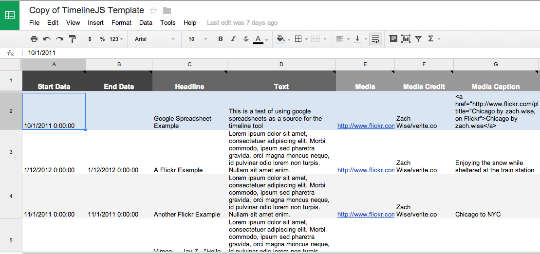
For my data projects below I used data from the CDC website on Ebola cases and deaths. In the Datawrapper and Many Eyes projects I used and XL Spreadsheet. In the Timeline JS project I used Google Spreadsheet. Timeline JS has a Google Spreadsheet template for you to copy and use to create your own project. The Timeline spreadsheet must be a Google sheet so it can be published to the web.
You can download my data sheets from Google. Ebola cases and deaths, Widespread ebola and Google sheet for Timeline JS.
Datawrapper is used to create simple charts, graphs, data charts and maps by many news organizations, including Vox.
Many Eyes is a project of IBM and allows users to create word tree, tree maps, bubble charts, bar charts, maps and other visualizations of data. Many Eyes works best with Safari or Firefox on the Mac and Firefox on a PC.
Timeline JS was created by Zach Wise for The Knight Lab. Timeline JS allows you to use a Google Spreadsheet to make an interactive timeline with text, images, video and sound clips.
All three of these tools create embed code which can be pasted into an article post for most content management systems.
Same data, different visualizations
Datawrapper
Leading causes of death in Africa from WHO
Many Eyes Bubble Map
Datawrapper
Timeline JS